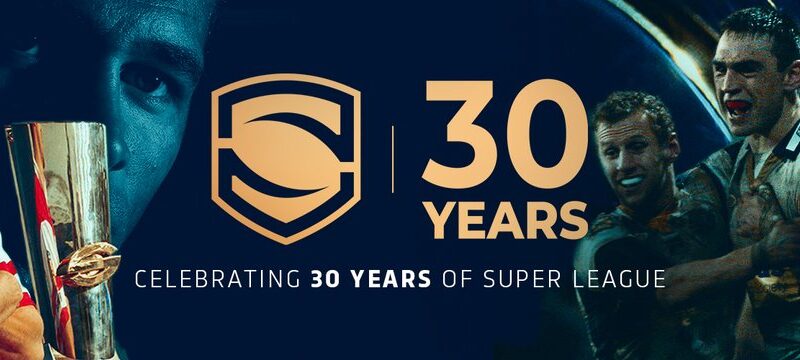
Every Super League club’s 2024 kit rated – in order
With the big kick-off just over three weeks away, and every kit revealed – for now – here’s my rundown of every single one, in order from top to bottom.
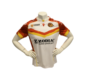
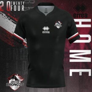
Fair play to the Broncos, they’ve nailed it with this 90s throwback. Lacking sponsors, but hopefully they’ll sort that before the start of the season.
9/10
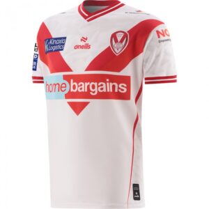
There’s only so much the designers can do with a Saints home shirt, but they’ve nailed it here. Nice and simple, and the collar’s a lovely touch.
8/10
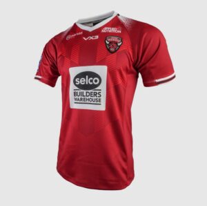
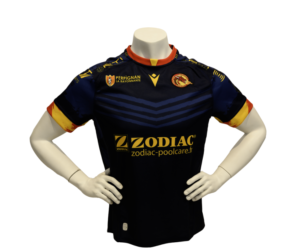
Similar to Saints, the designers have nailed this one for simplicity, and not tried reinventing the wheel.
8/10
If it’s not obvious yet, I like a simple design on a home shirt, and they’ve done a good job here. Maybe a bit too plain, but a solid effort overall.
7/10
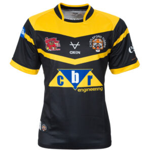
I love how bold and simple this shirt is, the only thing lacking is the amber.
7/10
Another no-frills home shirt, this one’s impressed me more than it should for such a simple design.
7/10
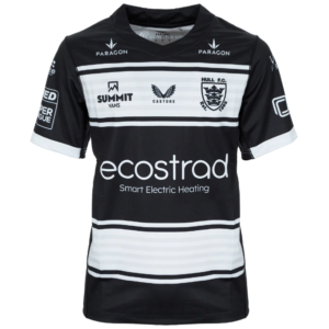
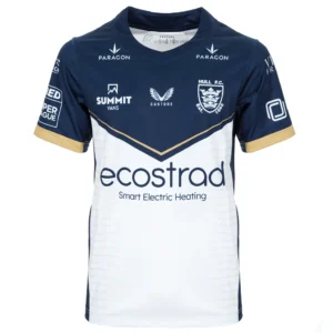
There’s a clear pattern here – home shirts that keep it simple. Big fan of this effort from the Black & Whites.
7/10
Another straightforward design from the Dragons, not too many frills attached to this one, which appeals to me.
7/10
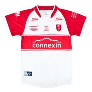
Nice and simple home shirt from the Robins, but with the subtle addition of sublimated robin icons on the sleeves.
7/10
I don’t even know what a heritage shirt is, but this looks nice. Would make a decent home shirt if they hadn’t gone for the odd choice of white.
6/10
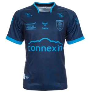
Solid if not spectacular from the Wire. 10 times better than the away shirt, which probably helps make this seem better.
6/10
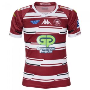
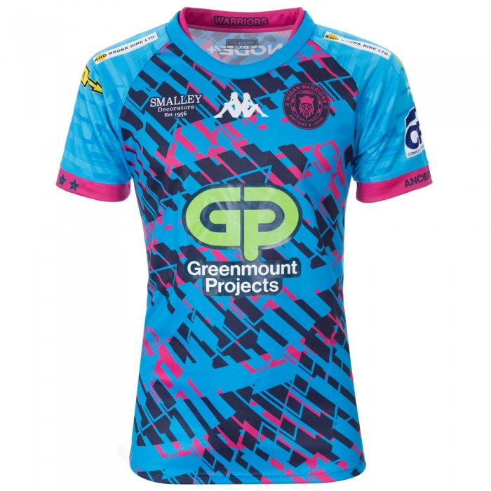
Not one of Wigan’s best home shirts, but at least you can tell what it is at a glance. Not like some of the ‘experimental’ ones they used to come out with.
6/10
Solid effort, nothing to shout about but doesn’t give me a headache, which is why this gets a mid-table place here.
6/10
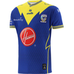
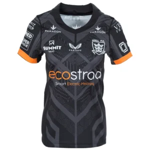
Exactly as the Hull KR away. Solid, simple, and at least it’s not too loud.
6/10
I feel like I’ve hit a bit of a brick wall of simple away shirts here. Again, nothing to shout about but not horrendous either.
6/10
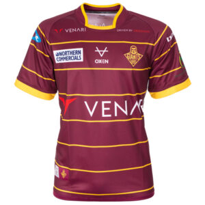
If this gets some sponsors on it, it could jump up a bit, but right now it just looks far too plain and rushed.
5/10
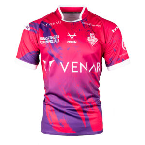
The sponsors blend into this better than they do on the home shirt, which is why this edges it. Still pretty ugly though, but full marks for standing out.
5/10
Dull. Not much more to say on this.
5/10
Ok, nothing much to shout about. Looks too much like a Cas shirt at first glance.
5/10
I don’t expect anything less from a Leigh shirt nowadays, so now I’m getting used to their outrageous designs, this isn’t the worst thing I’ve seen in 2024.
5/10
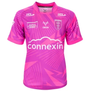
Not a great design, but boosted by the fact it’s a lot nicer than the away shirt and that some of the profits go to charity.
5/10
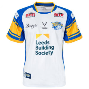
This isn’t too bad, but they’ve got their shirts all over the place this year. This should be the 3rd, the home should be the away and the heritage should be the home.
5/10
I’d love to have been in the briefing for this one. What is it? Looks like it was knocked up in 20 minutes on Paint.
4/10
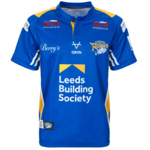
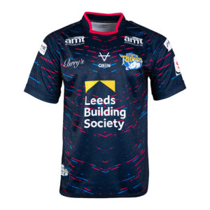
I actually quite like this one, but it just doesn’t look like a Leeds home shirt. If it was the away, it’d be much higher, but the home one should be blue and amber.
4/10
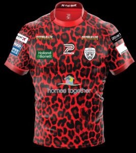
I have a horrible feeling this will grow on me during the year, but right now it’s far too garish.
4/10
If you gave some primary school kids a couple of tins of paint and told them to throw it, you’d get something similar to this. Horrible.
3/10
Top marks for trying something different with the away shirt, but looks-wise, this is a shocker.
3/10

This monstrosity just has the look of a shirt that’ll be worn in a 60-0 mauling somewhere – probably Perpignan – and then never seen again. Just horrible.
2/10

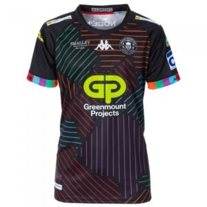
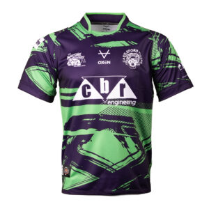
I can’t get on board with this at all, and I’m a Wigan fan. Where do you even start with this? Just a multi-coloured mess.
1/10