Every NRL club’s 2024 home and away kit rated – in order

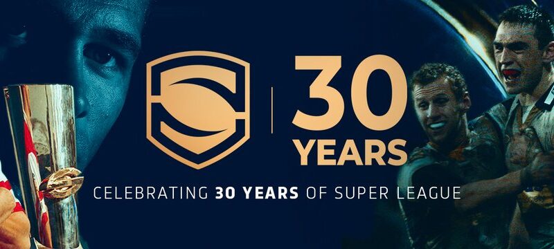
So, as it turns out, ranking the Super League kits is a much easier job than the NRL ones. Most of these look exactly the same as last year, but at least the designers aren’t left to run amok with a paint brush on the Aussie kits. Anyway, until all the special kits come out throughout the year, like the Indigenous jersey, the ANZAC jersey, the Women in League jersey etc, here’s my countdown of the home and away kits for 2024.
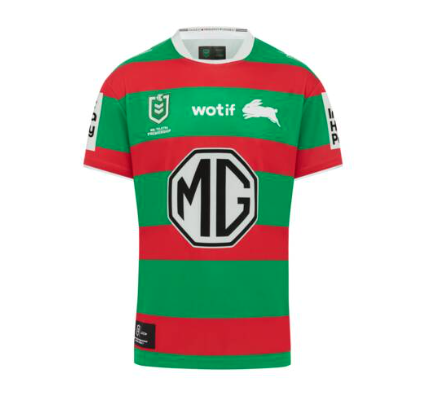
To the untrained eye, this might look like every Bunnies home jersey from the past 10 years, but it’s actually the first time since 2006 they’ve gone for full hoops all the way around. An instant classic
10/10
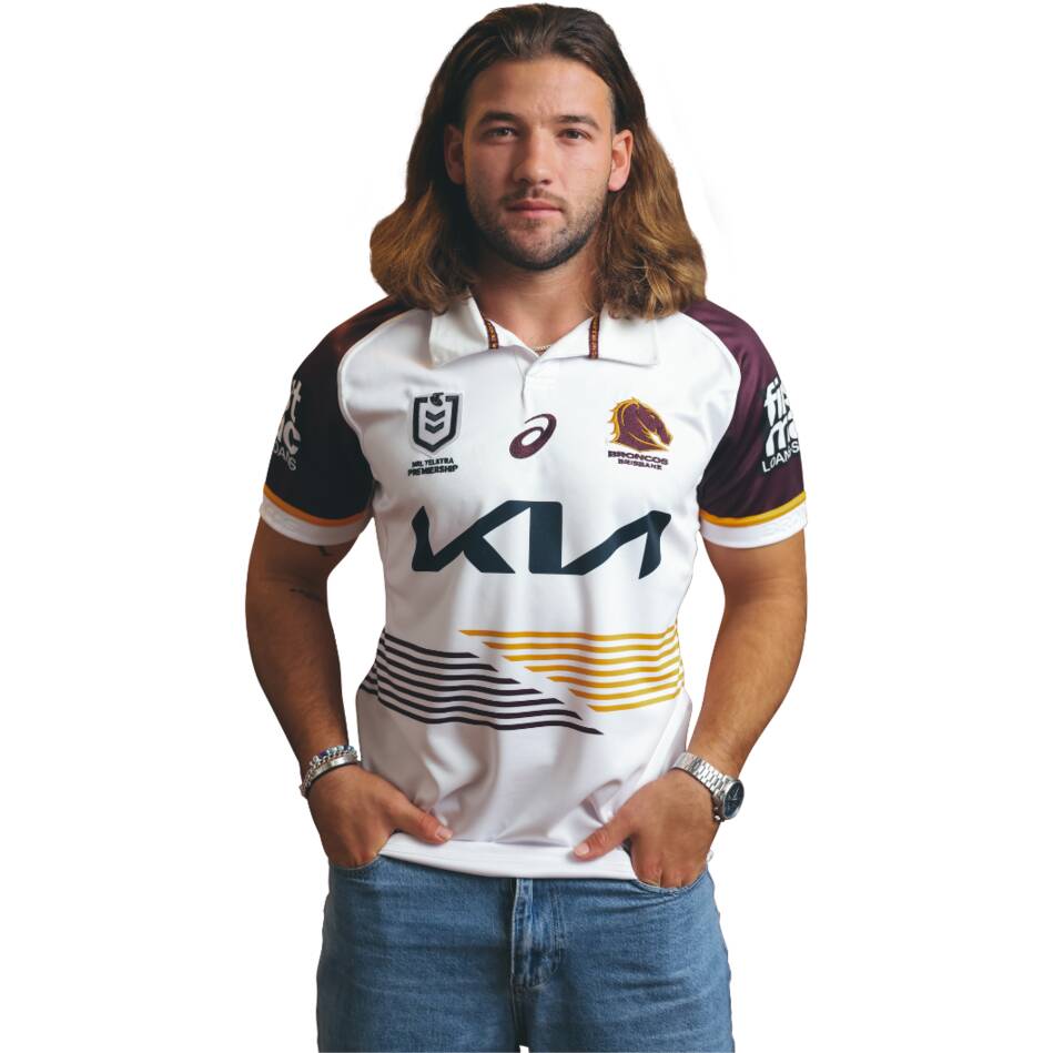
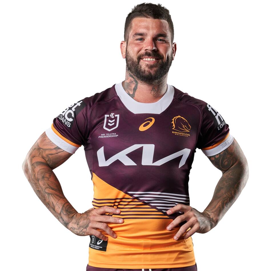
It’s the collar that does it for me with this one. A real throwback to the great Broncos sides of the early 90s, and just looks like a proper rugby jersey.
10/10
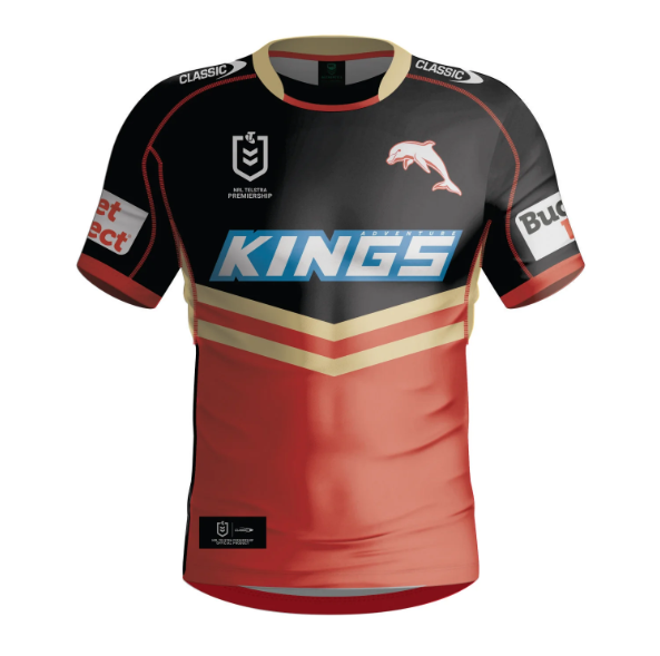
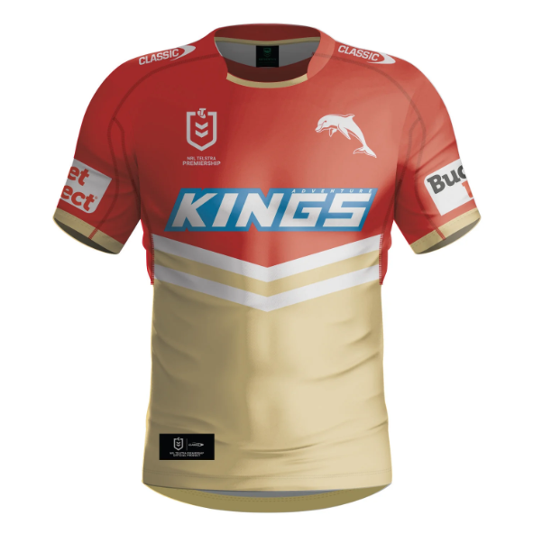
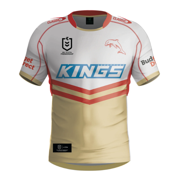
Ok, I’ve already cheated and thrown a 3rd shirt in there, but I couldn’t leave this one out. No idea how often the Dolphins will wear this – especially if they bring out special kits during the year – but this should get worn more than their away in my opinion.
9/10
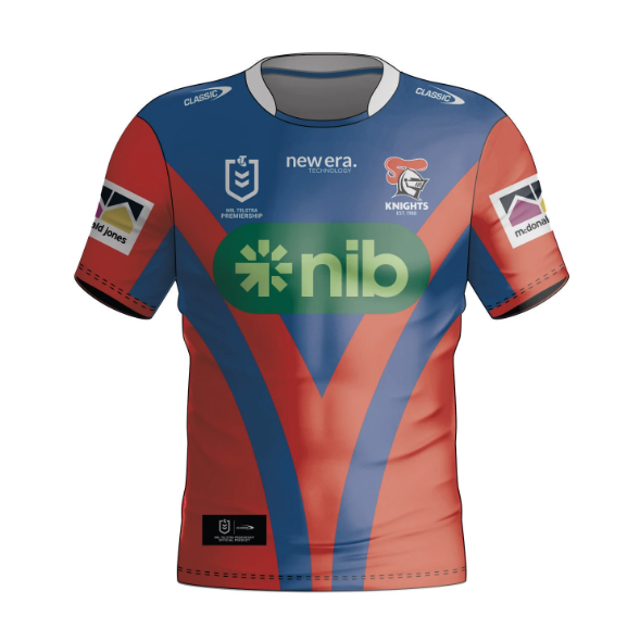
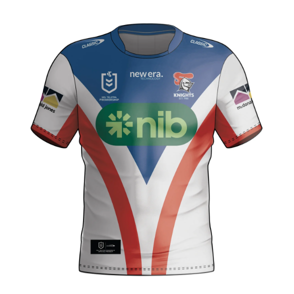
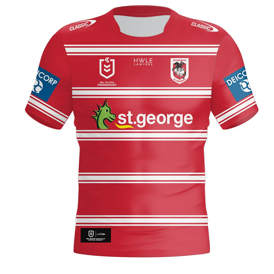
NRL clubs don’t tend to be too adventurous with their designs, especially the home ones, so top marks to the Knights for thinking a little outside the box. Still screams Newcastle, but with a slight twist.
9/10
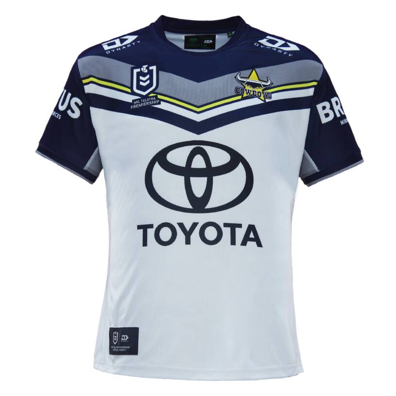
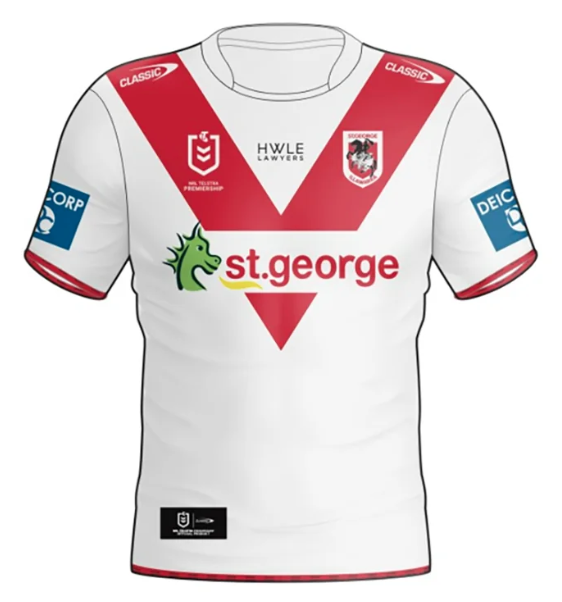
Just like the home shirt, full marks to the designers for trying something a little different here.
9/10
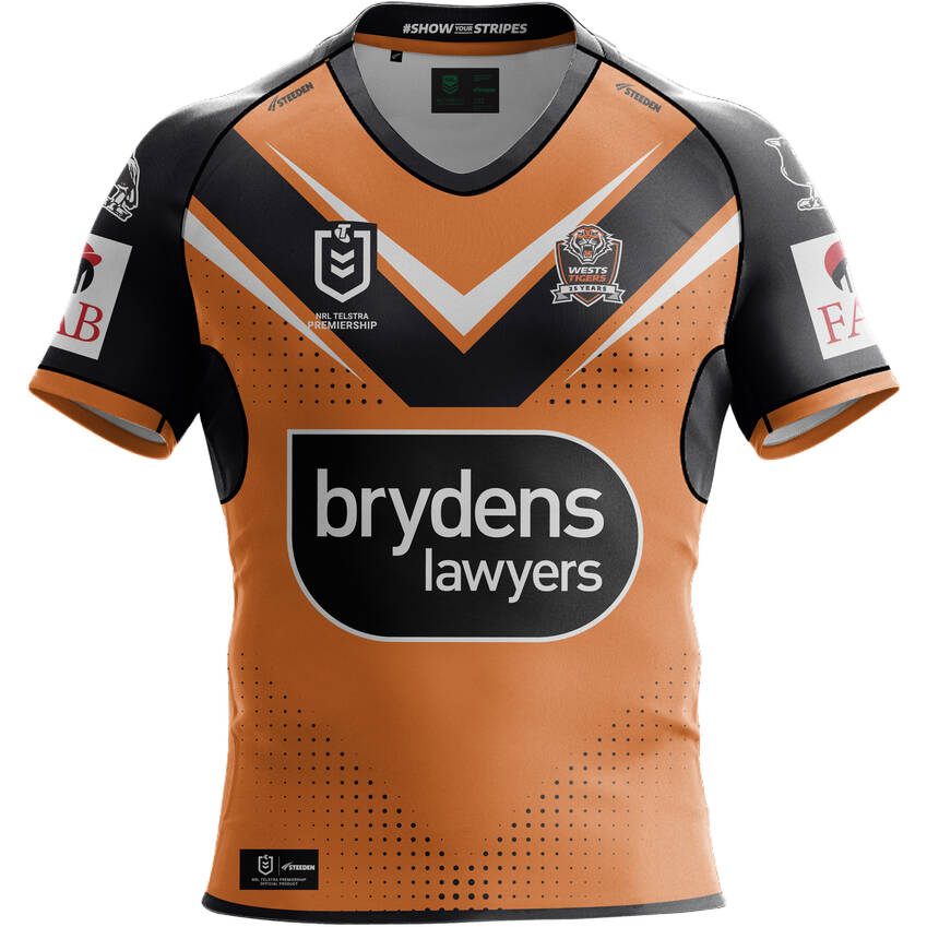
The anniversary badge and the jagged white lines give this shirt a real edge on a lot of the designs. Hopefully the Tigers can perform better in it than they have in the past couple of years.
9/10
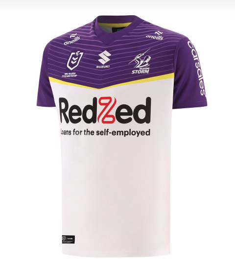
Credit to the Storm here for trying something a bit different with their away kit, without going overboard.
8/10
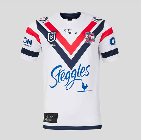
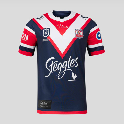
Roosters jerseys don’t tend to change much year on year, but this is a solid showing that feels slightly different to usual.
8/10
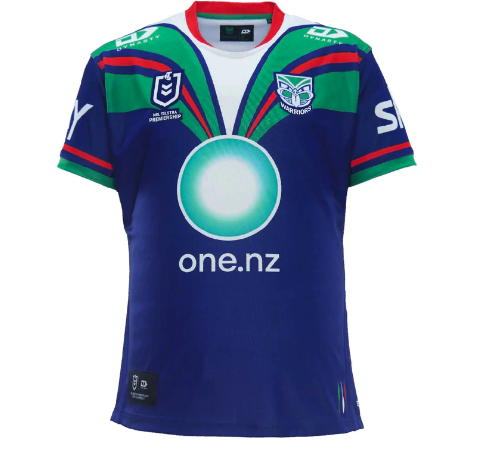
I’m a big fan of this Warriors shirt for the simple fact that it’s taken me back to the mid-90s when I started watching RL. A great throwback of a shirt.
8/10
The Broncos home shirt rarely misses the mark, and this one’s no different. Not spectacular, but pretty solid.
8/10

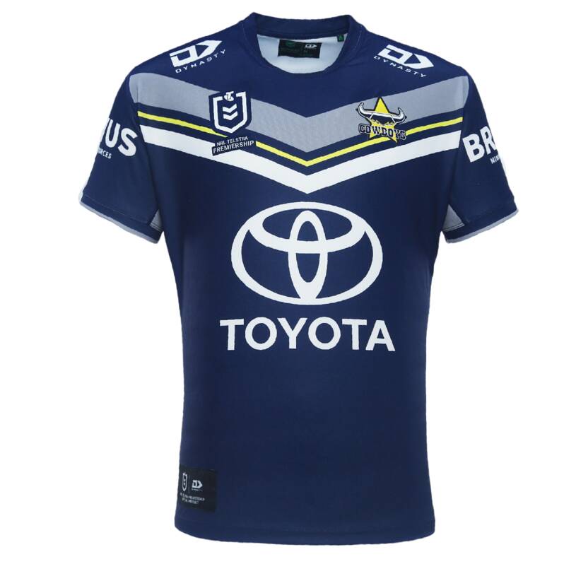
The only noticeable difference from last year is the main sponsor, but this is a pretty intimidating jersey for a very intimidating team.
8/10
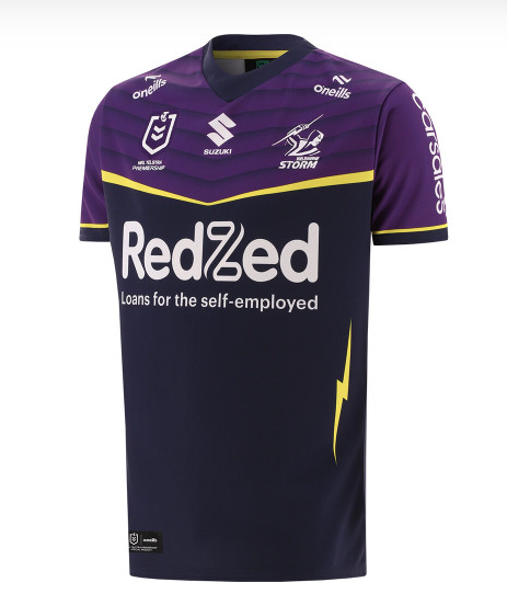
As with their away shirt, credit to the Storm for trying something different. And I love the lightning strike on the side of this one.
8/10

Just like their away shirt, it’s the anniversary badge and the jagged orange lines that give this shirt a real edge on a lot of the others. Feels extremely similar to last year though.
8/10
A bit like the Storm’s away shirt, in the sense that I like the fact they’ve tried something a bit different without going over the top. Not exactly a classic, but a decent design.
7/10
I’m a big fan of the stripes on the sides and the ones just below the sponsor. It doesn’t look much different from the 2023 jersey though.
7/10
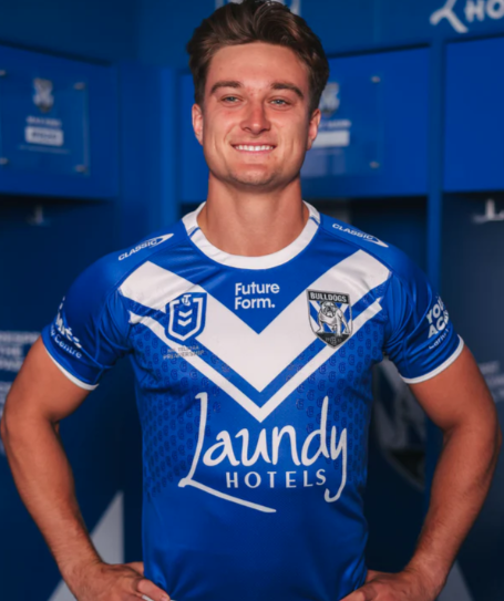
A solid effort from the Dogs, without jumping out at me.
7/10
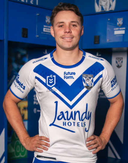
Another solid effort without jumping out. The away one edges it for me, probably because it reminds me of a Samoa shirt.
7/10
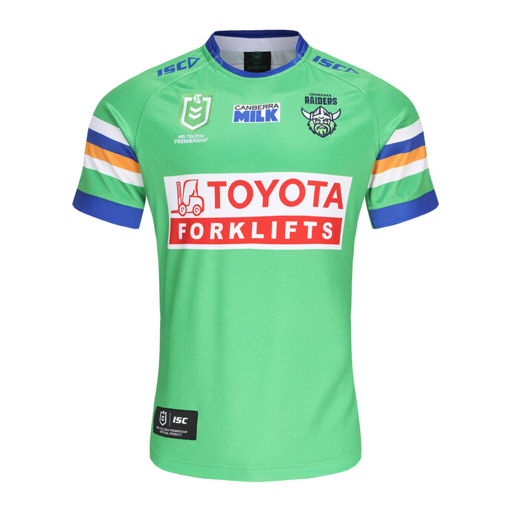
I’ve looked at this over and over, and I can’t see any difference from last year. Clean design though.
7/10
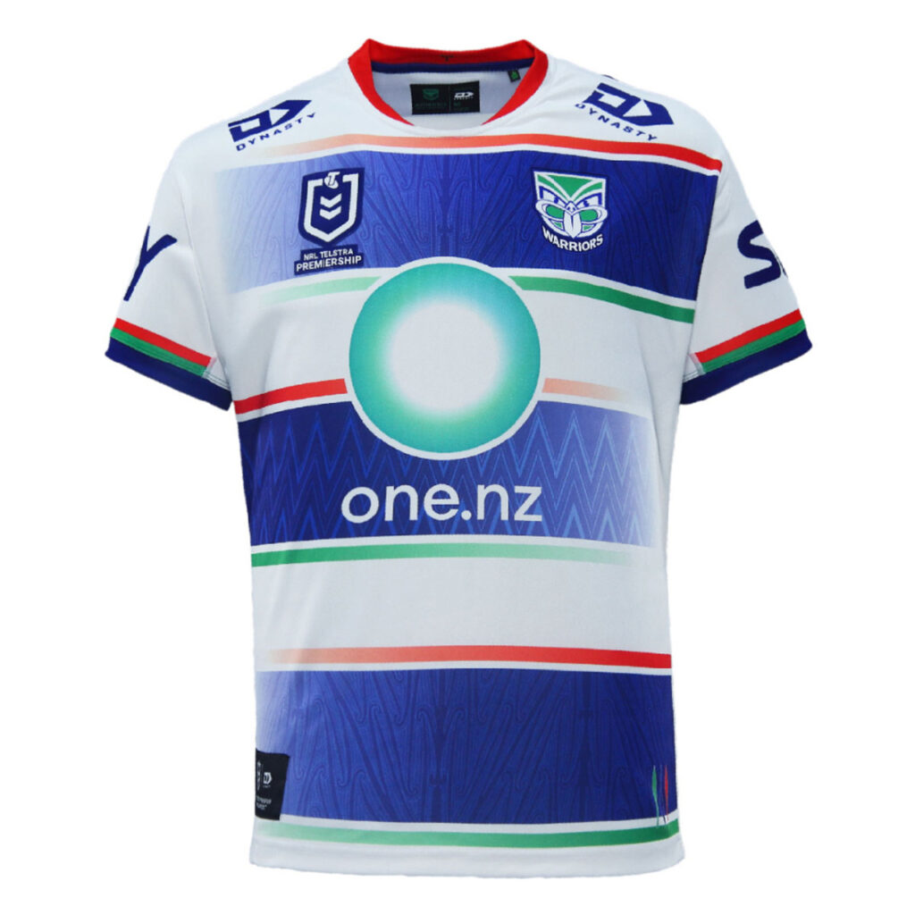
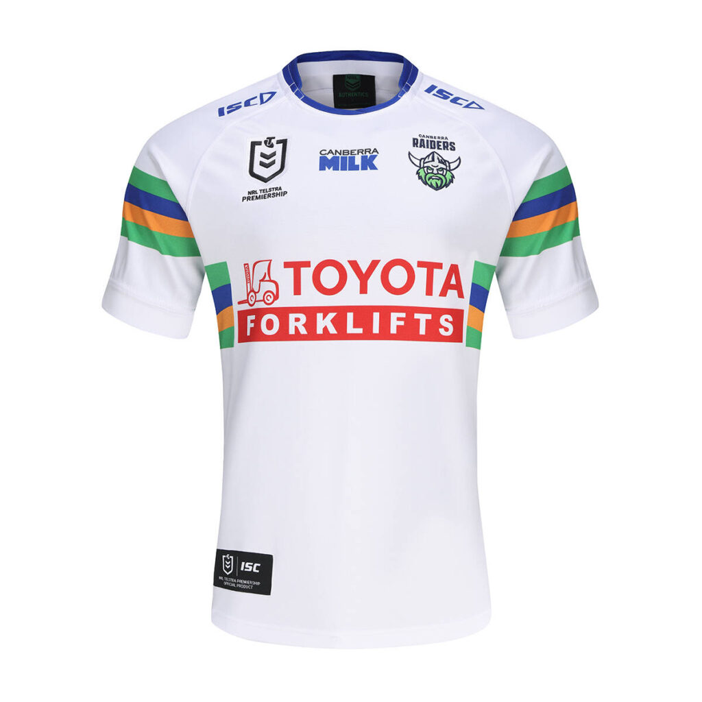
On the plus side, this looks different from last year’s shirt. On the minus though, I wouldn’t even know it’s a Warriors shirt at first glance. Would have been better if they’d flipped the colours from the home shirt.
6/10
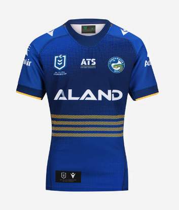
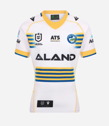
Plus points for coming up with a new design this year. Nowhere near enough gold on this to be an Eels jersey though.
6/10
Remarkably similar to last year’s jersey. Nice enough design, but could do with freshening up.
6/10
I could’ve pretty much copy and pasted what I wrote for the home jersey here. They should make the 3rd one the away, and get rid of this.
6/10
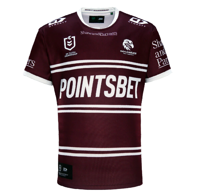
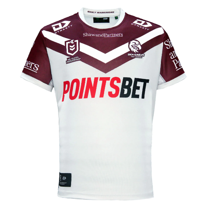
On the plus side, this is quite clearly a Manly shirt, but on the other hand, it’s almost identical to last year’s, except for the new badge, which I’m a big fan of.
6/10
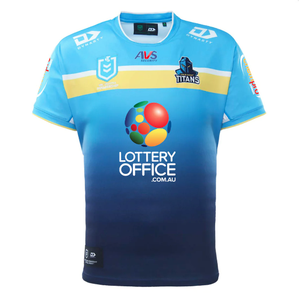
Pretty sure the only thing that’s new about this is the sponsor. Disappointing from the Titans.
5/10
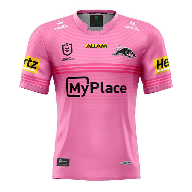
Again, it looks like the only thing that’s different about this is the main sponsor. Not usually a fan of pink kits, but when a team’s as good as the Panthers, they can wear what they want.
5/10
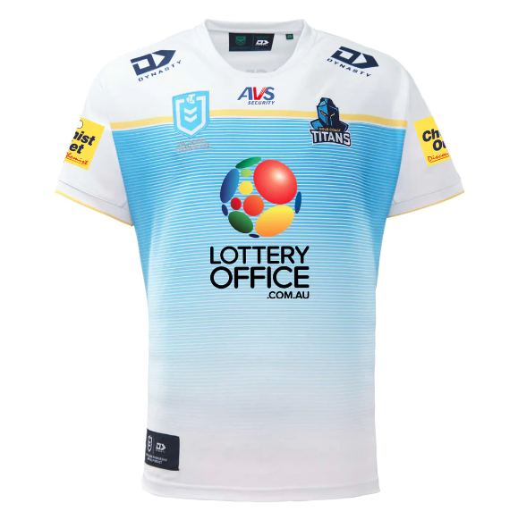
Read the home description, it might as well have been copied and pasted.
5/10
I’m really struggling at this point. Can anyone tell me what’s changed from 2023?
5/10
Nice design, but can’t help thinking I’ve seen it before. Oh yeah, last year.
5/10
I’m starting to give up now.
4/10
At this point, I’m starting to think a number of NRL clubs released a statement where they said they’d keep the same shirt but continue to charge full price.
4/10
Again, this is last year’s jersey recycled.
3/10
Finally, a new design again, of sorts! Although, why on earth do Souths’ release an away shirt that’s the same colour as the home? Have never understood this, and for that reason, it’s being marked down.
3/10
Another one that I’m struggling to see the difference with.
3/10
Oh come on now!
2/10
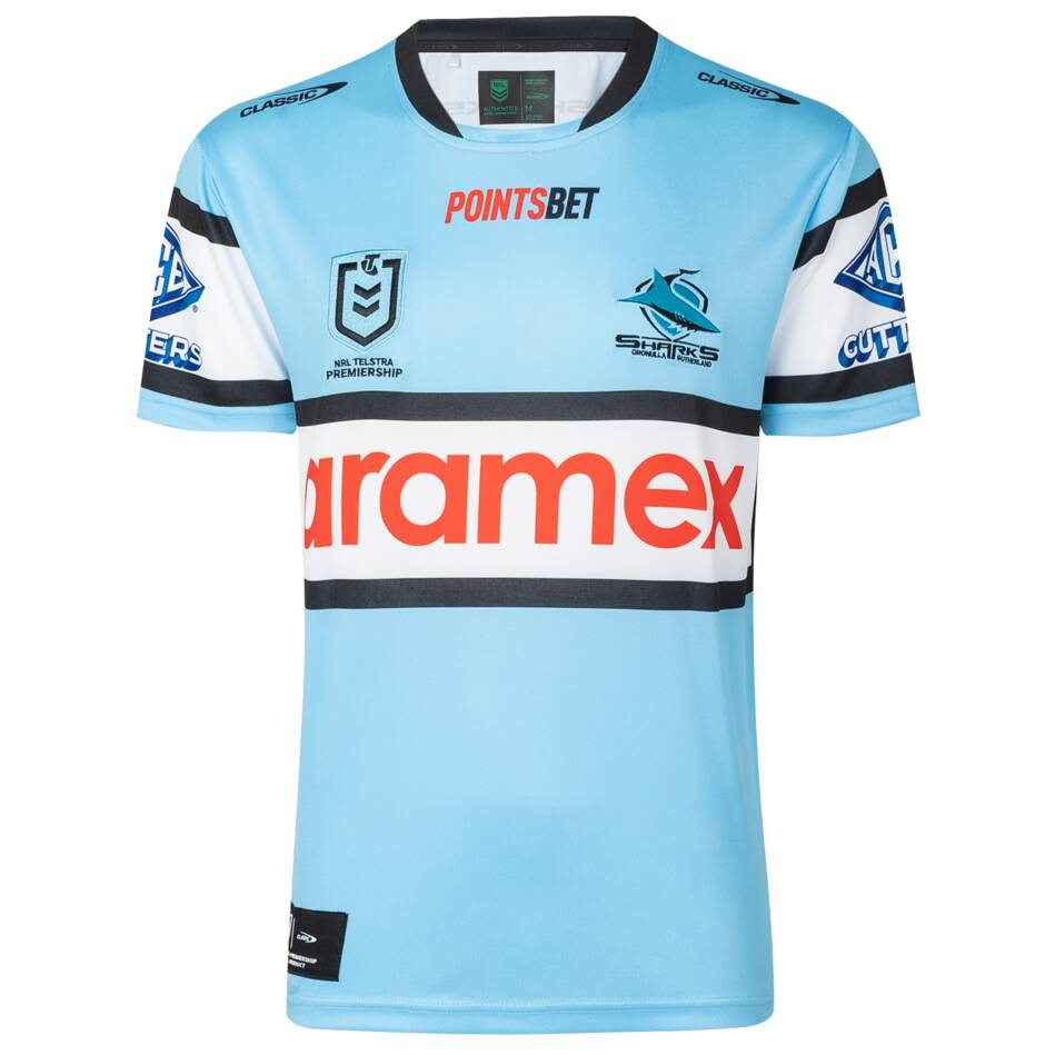
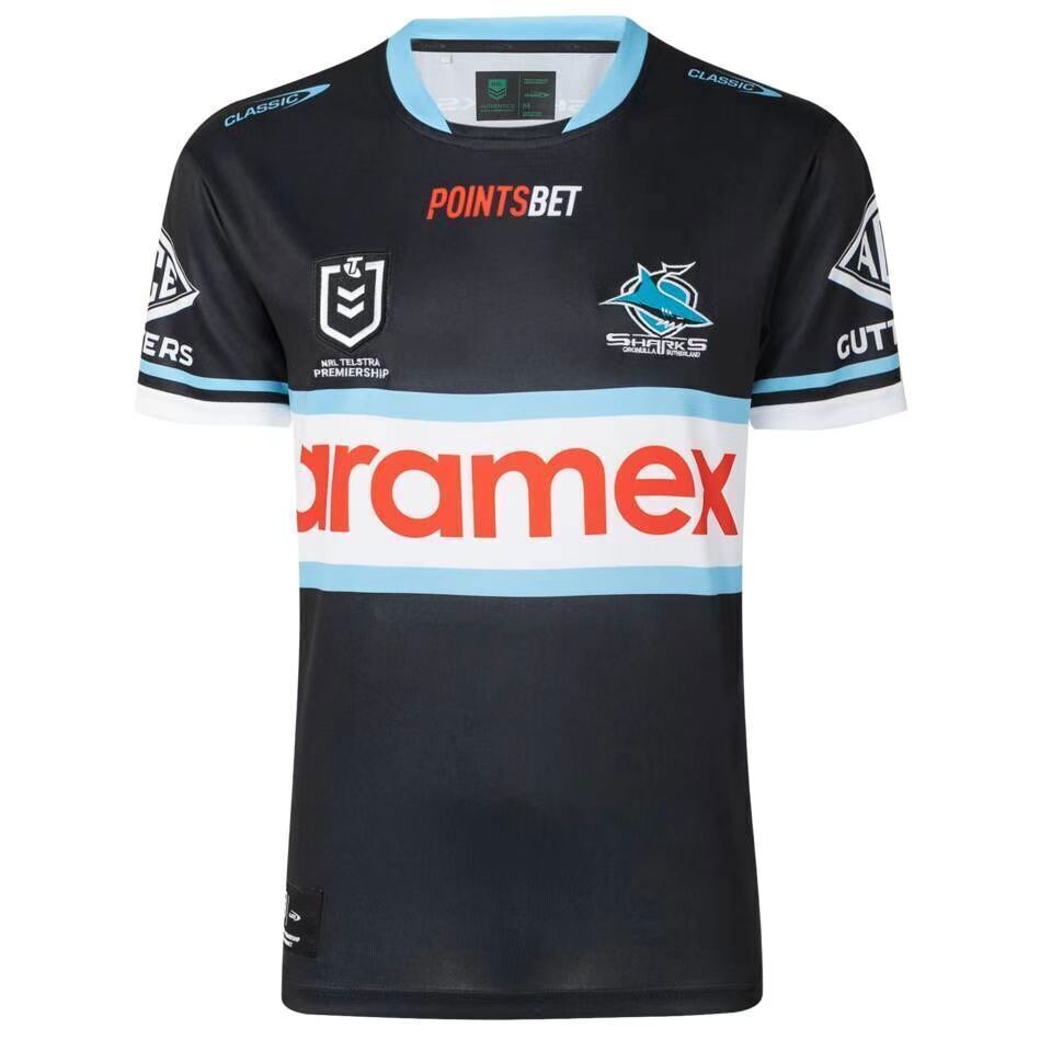
Finally, the end. Maybe it’s a bit harsh to put the Sharks at the end, but it was the first one I noticed that was the same, so they can stay there.
2/10